You and I, we deal with tons of data on a daily basic at work, at school or even at home. Sometimes, it can be overwhelming to manage multiple content assets with multiple sources of data. To communicate effectively with data, the data visualizations used should be attractive and clear to the target audiences.
Benefits of good data visualizations
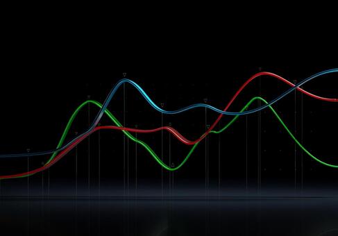
Colors and patterns are appealing to the eyes. Most people can easily distinguish different shapes and high contrasting colors. By using visual elements like graphs, charts, maps, and infographics correctly and meaningfully, we can bring clarity in an instant, and of course, audiences can understand the content we want to convey in no brain.
We can list out some of the advantages when using visual aids in communication as below:
- Using visual aids like charts and graphs as an add-on to your words will keep audiences’ attention and make them remember better. It’s a kind of storytelling with a purpose.
- With effective use of visualizations, communication of all kinds will be clear with very low chances of misunderstanding.
- Since the audiences understand our content better with visualizations, we can easily involve them in our follow-up activities, hence the experience can be boosted to another whole new level.
Different types of visualizations
Simple charts and graphs could be come to your minds immediately as thinking of data visualizations. Actually, there are many methods to present data effectively in an interesting way.

Common types of data visualization:
- Charts
- Graphs
- Infographics
- Tables
- Maps
- Dashboards
Create your charts easily in minutes with our new Chart Tool features on editorAC.

Other stock chart and graph photos and videos


See more videos of charts and graphs here.